Task
Several group companies needed clear rules, so that everyone on the team could create material that fits the brand.


Brand guidelines
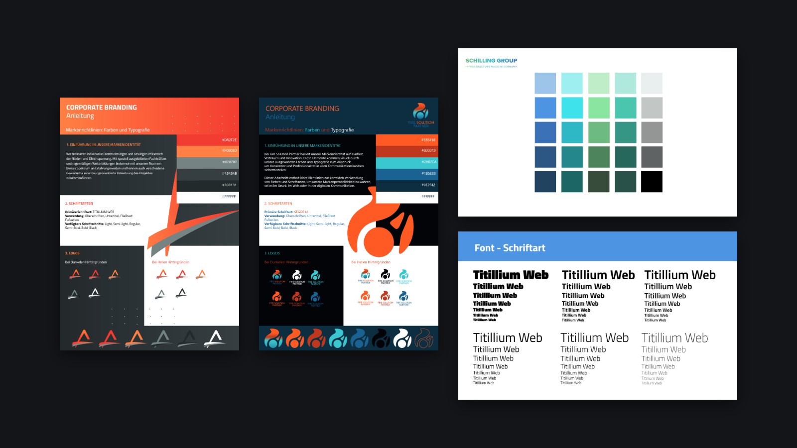
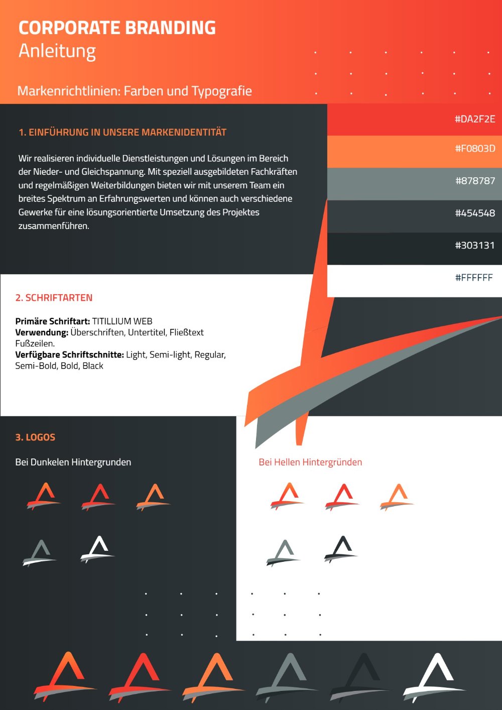
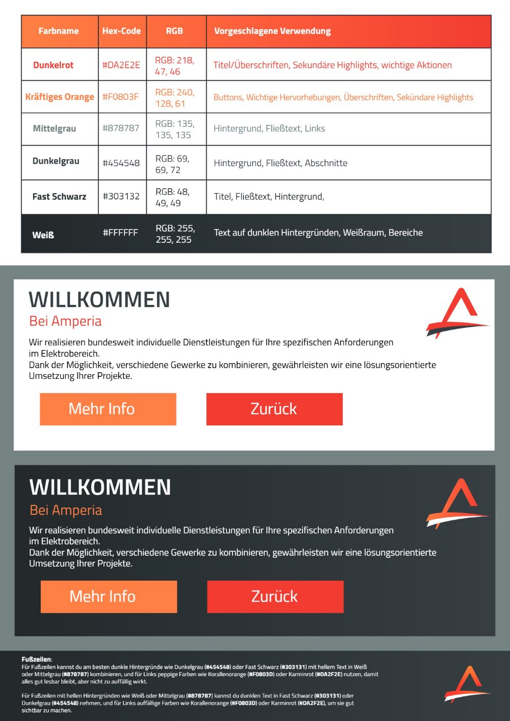
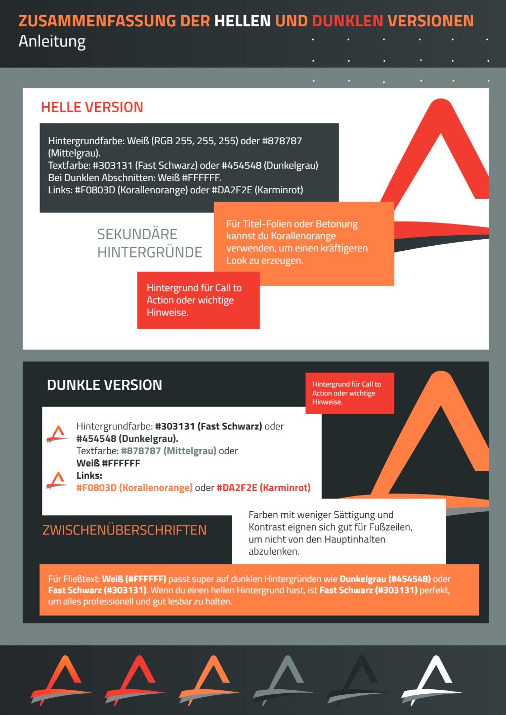
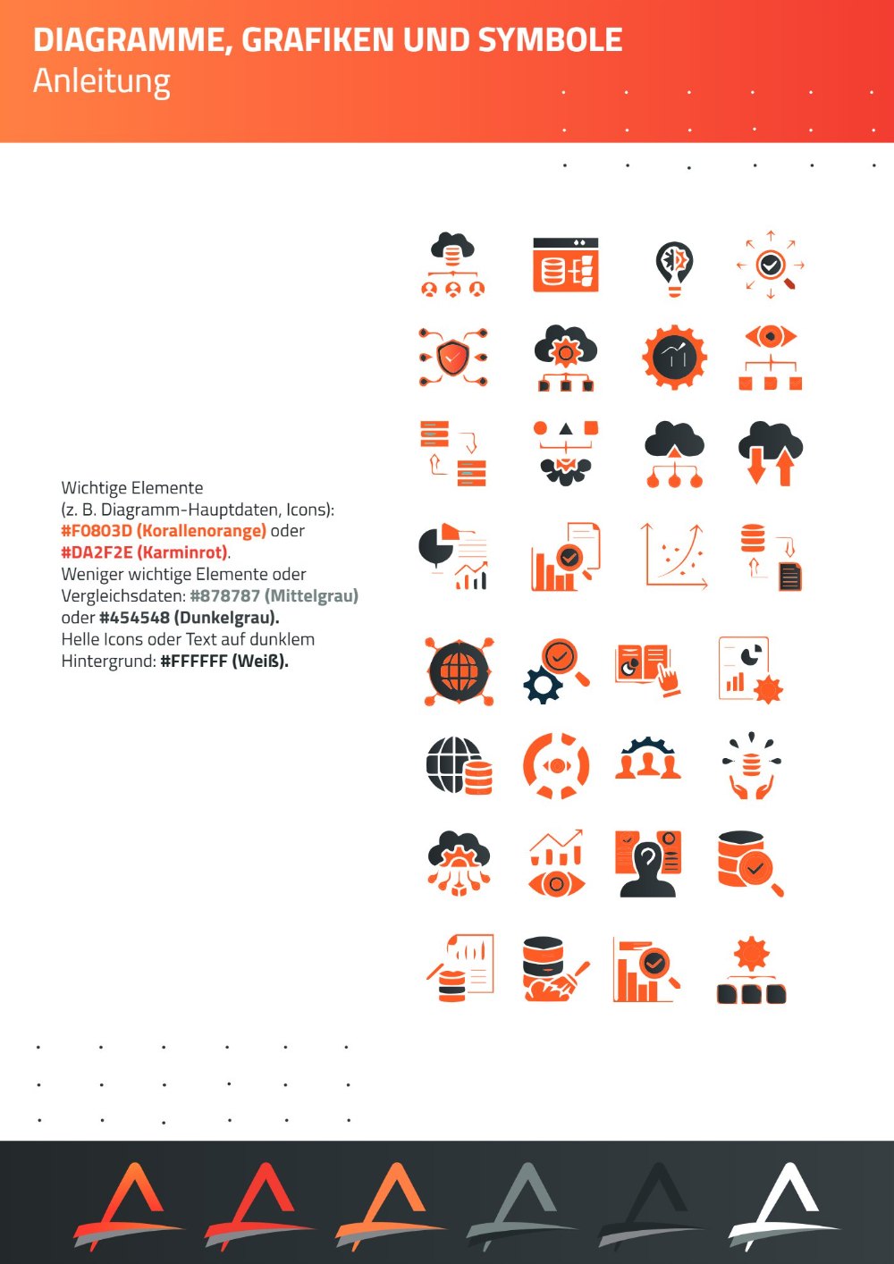
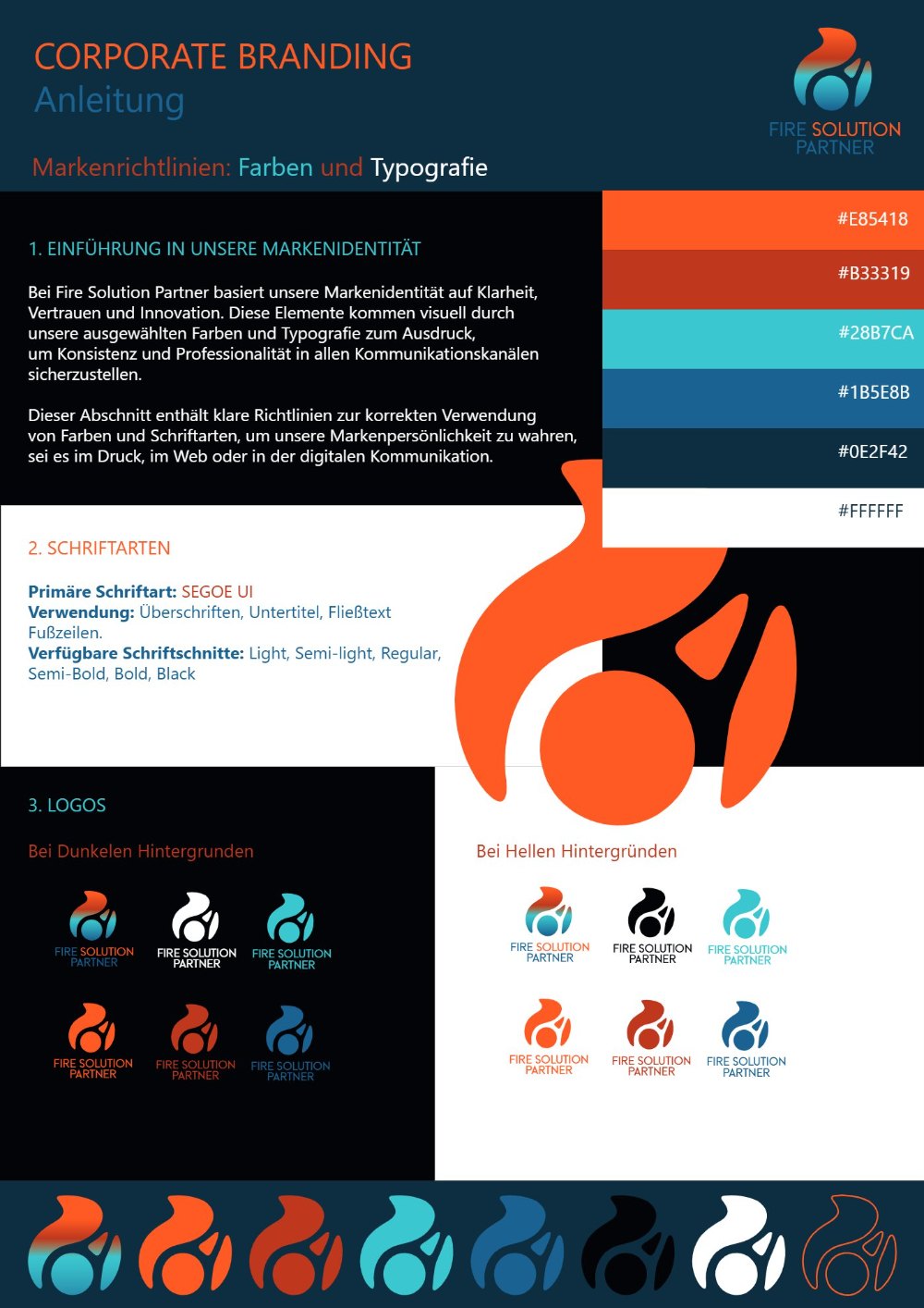
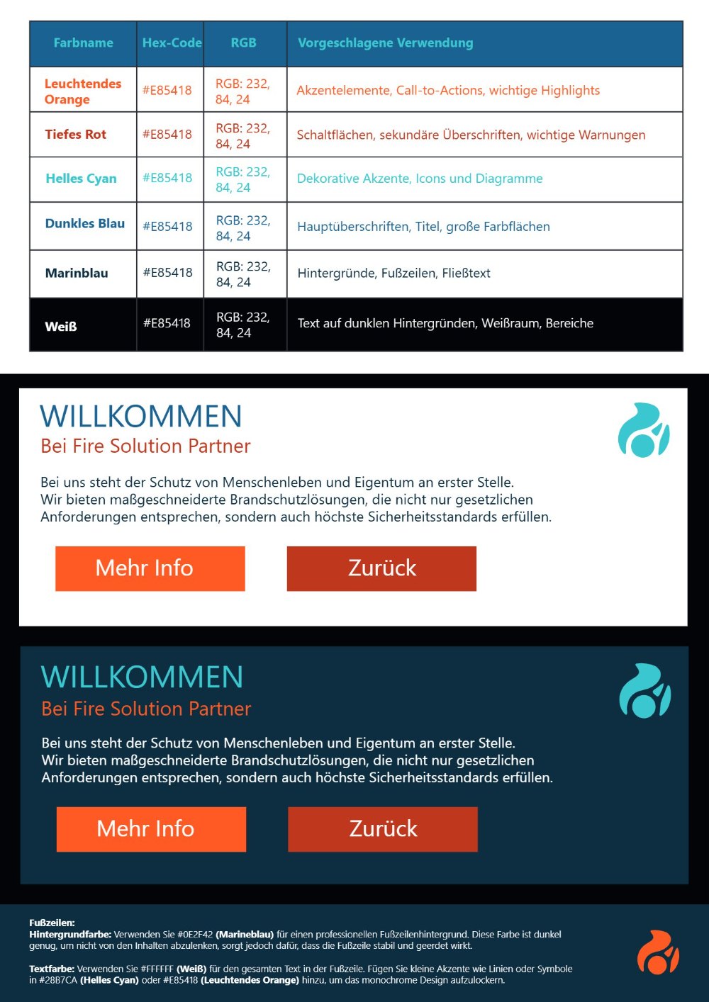
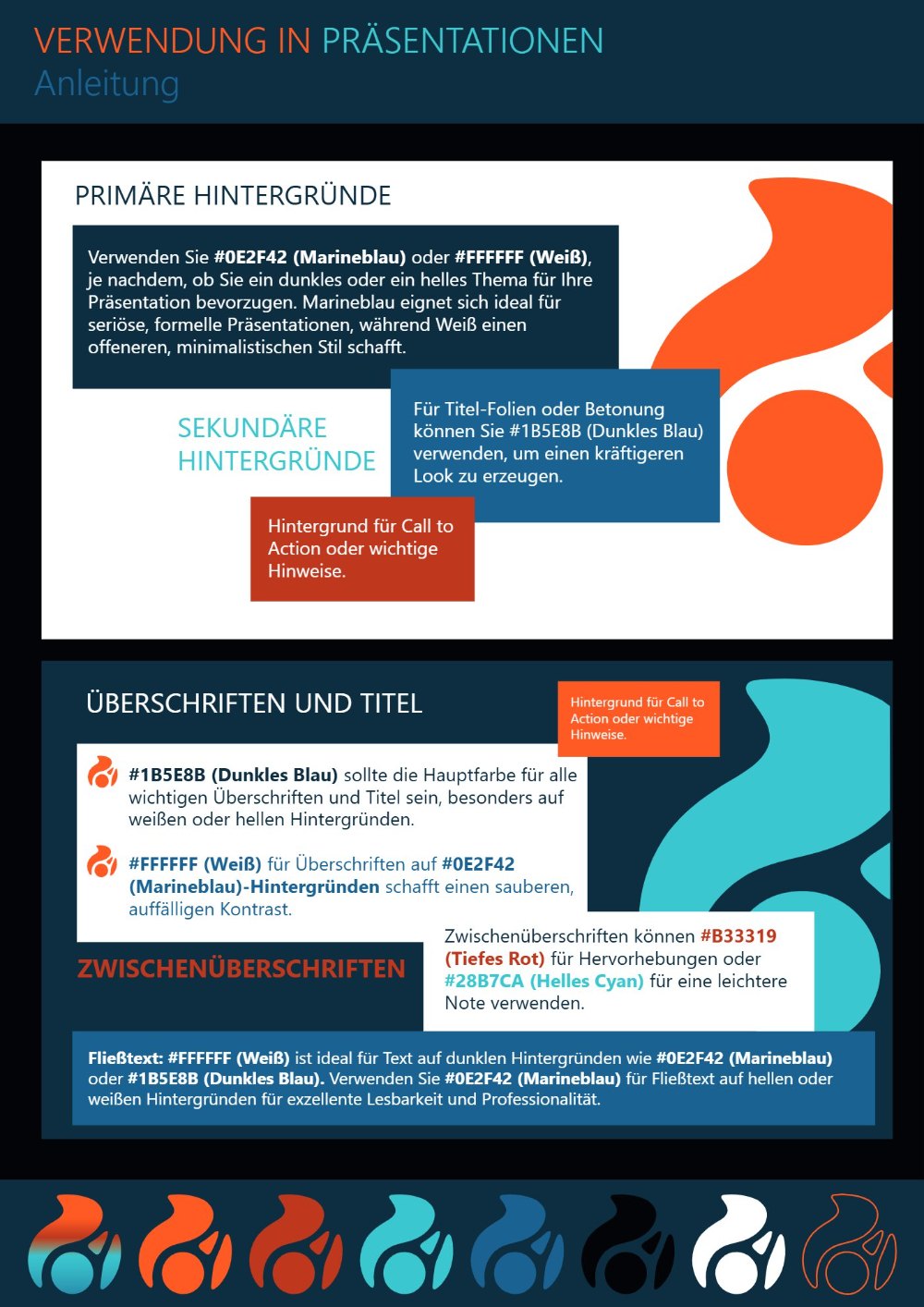
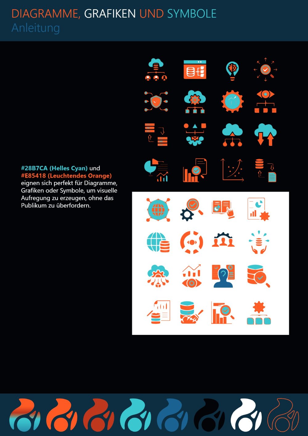
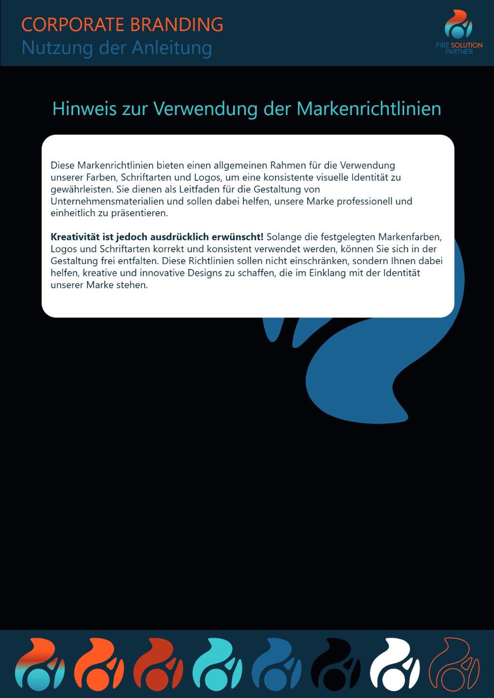
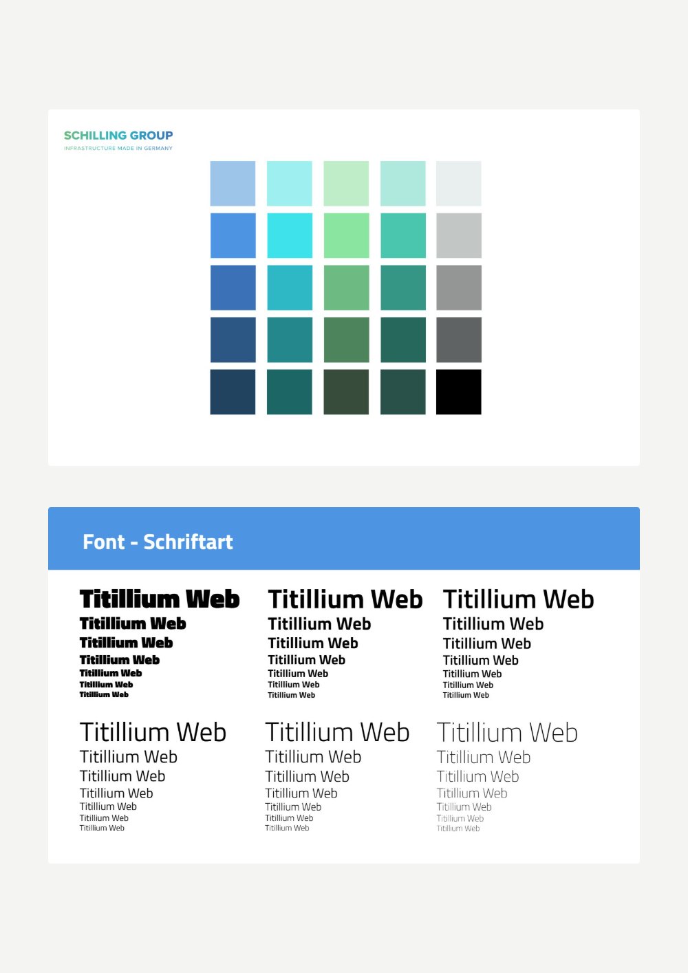
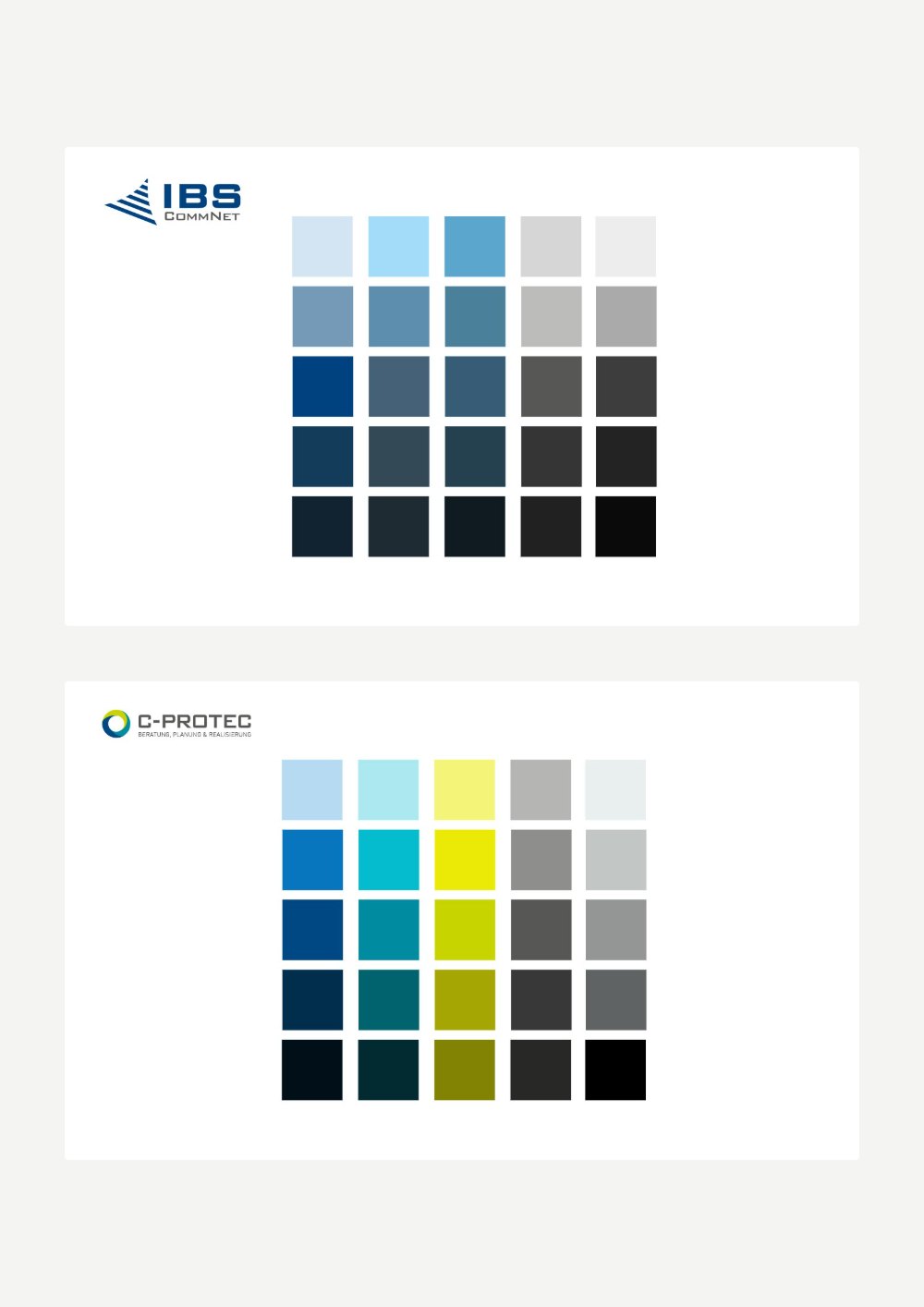
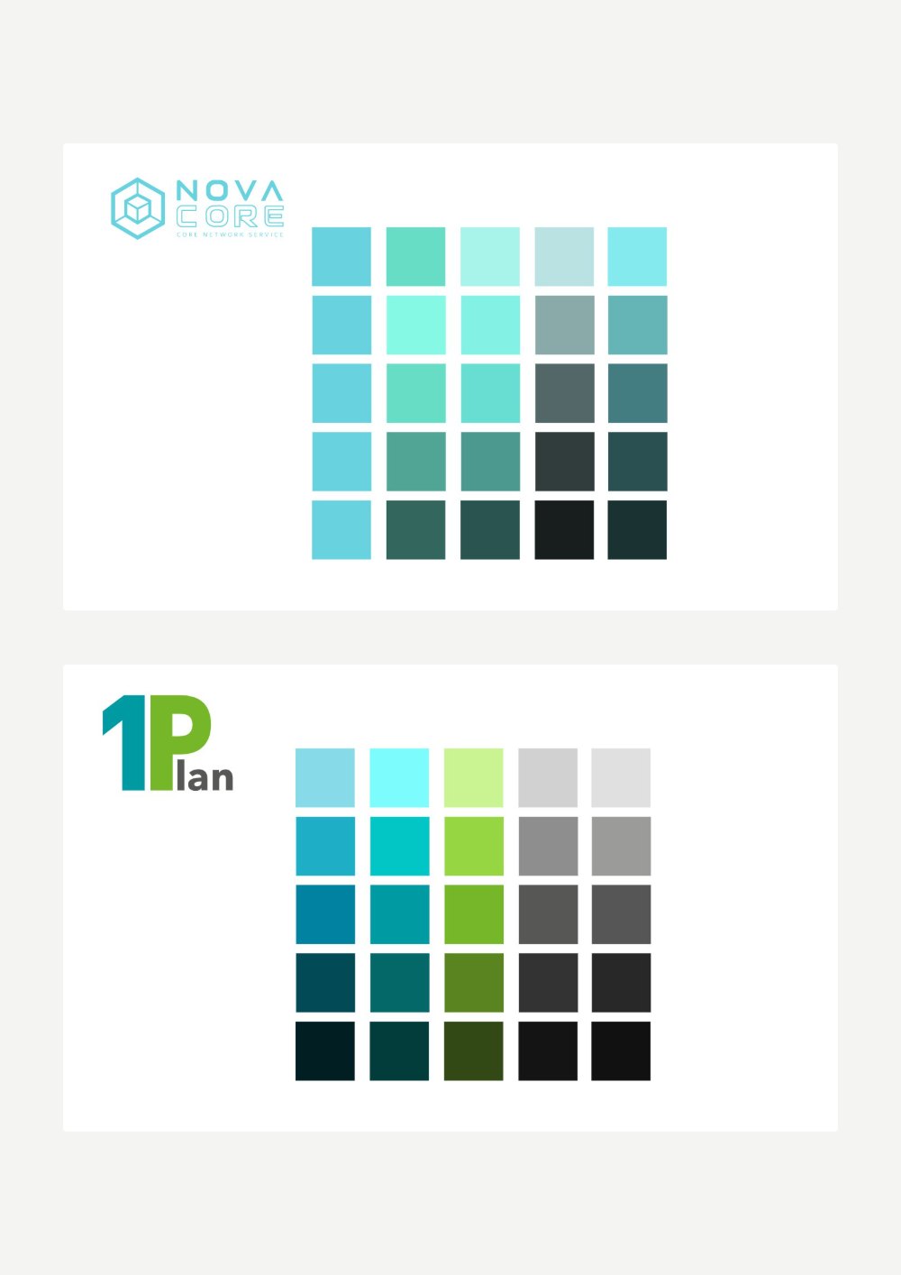
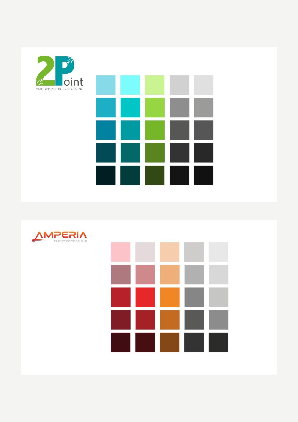
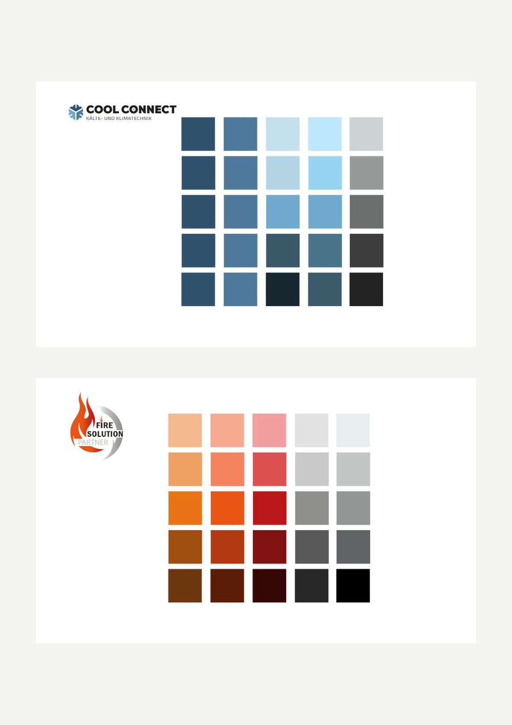
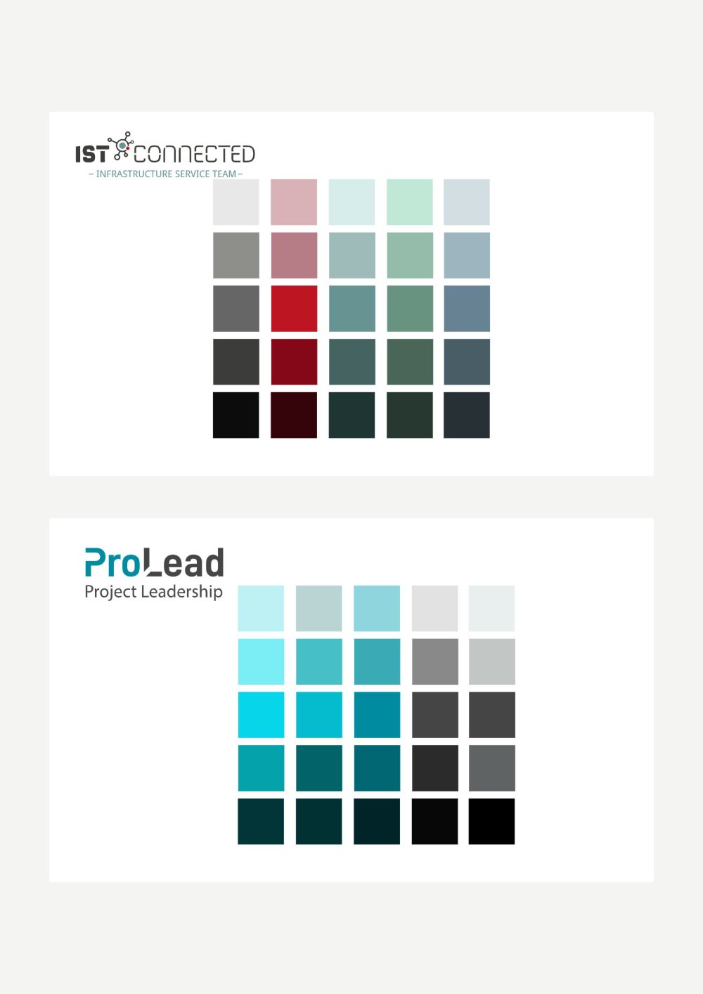
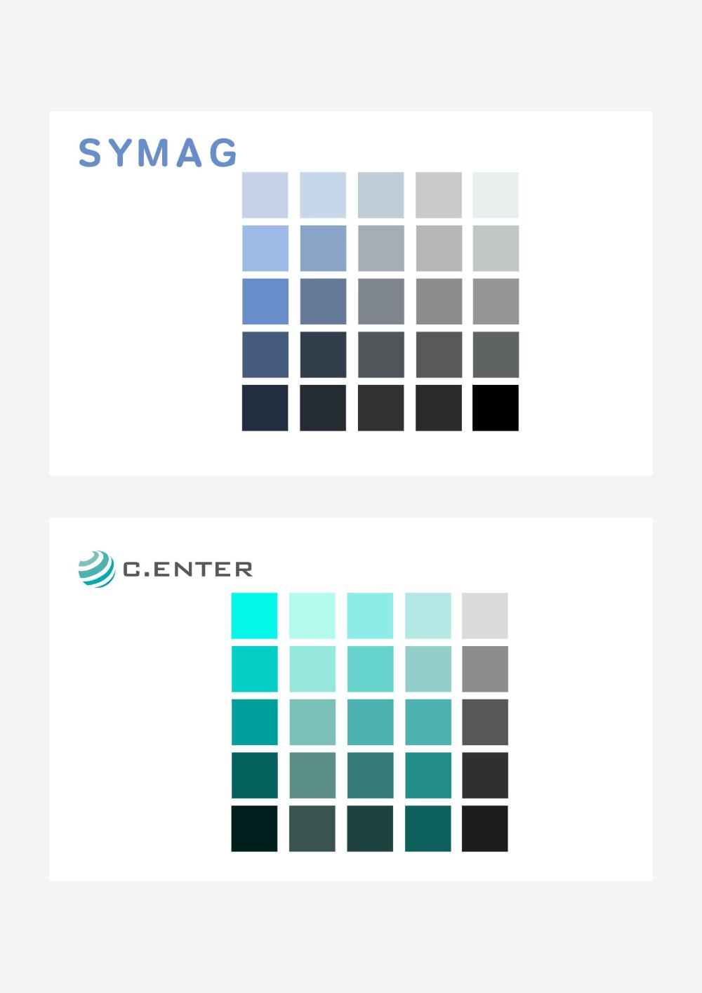
Brand guidelines for companies of SCHILLING GROUP: colours, typography, logo use, light and dark versions, icons and presentation rules, plus colour palettes for all 13 brands of the group. Flip through the book below.
Several group companies needed clear rules, so that everyone on the team could create material that fits the brand.
One handbook structure for every company: colours with hex codes, typefaces, logos on dark and light backgrounds, buttons, icons and presentation layouts. Shown here for Amperia and Fire Solution Partner.
Handbooks for Amperia and Fire Solution Partner, and a shared palette system with five shades per colour for all 13 brands.
Click a page corner, drag it, or use the arrows.
Book a free 15-minute call and let's talk about your brand.